
All Among the Barley
Melissa Harrison – a reflection by artist Neil Gower
Artist Neil Gower writes about the cartographic collaboration with author Melissa Harrison for her latest novel, All Among the Barley, and reflects on the comfort that maps drawn in novels bring.
There is always a frisson when I open a book to find a map – a thrill of anticipation and a sense of reassurance. This is the territory into which I am about to embark, here is something constant I can refer to along the way.
A map at the start of a book – any book – always recalls childhood reading for me: a time when looking at ‘100 Aker Wood’, the swirling blue-green ripples of Swallows and Amazons and the black teeth of Mordor all quickened my pulse. It was thrilling to discover not just these lands but the excitement of reading itself and the power of printed matter to transport me.
Now I am grown I take a particular delight in drawing maps for books with the aim of beguiling and guiding the attentive reader. I also design covers for books but that has to be done under the scrutiny of the publisher’s marketing department, an entity often at odds with the vision of the author and how I feel the text should be interpreted. Drawing a frontispiece- or endpaper-map is a refuge from such conflicting demands. It is a place where I can engage more freely with the text; it is a refuge on the lee side of the cover, between the book’s public face and the domain of the author within.
I’ve lost count of the maps I have drawn for books but most started life as that intriguing phenomenon: the “author’s own sketch”. These are executed with varying degrees of finesse but all offer a fascinating glimpse into the writer’s psyche. At one end of the spectrum, Jilly Cooper’s are spectacular confections of winsome indecipherability – A2 Basquiat-esque collages of who’s bonking whom (and where) and the names of their pets. In the middle lie the hordes of fantasy writers who make me want to give Tolkien a good shaking for all he has unleashed. I wasn’t sure who to place at the opposite end of the spectrum until Melissa Harrison sent me her maps to accompany the manuscript of her new novel, All Among the Barley. These were unsettlingly accomplished and precise, almost print-ready. A roughly drawn map makes it easier for me to do my job, to pick up the author’s work and embellish it with my style. If they can draw, I have a harder job to interpret the map and to make it my own.
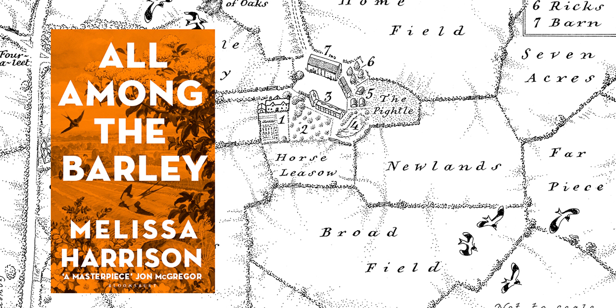
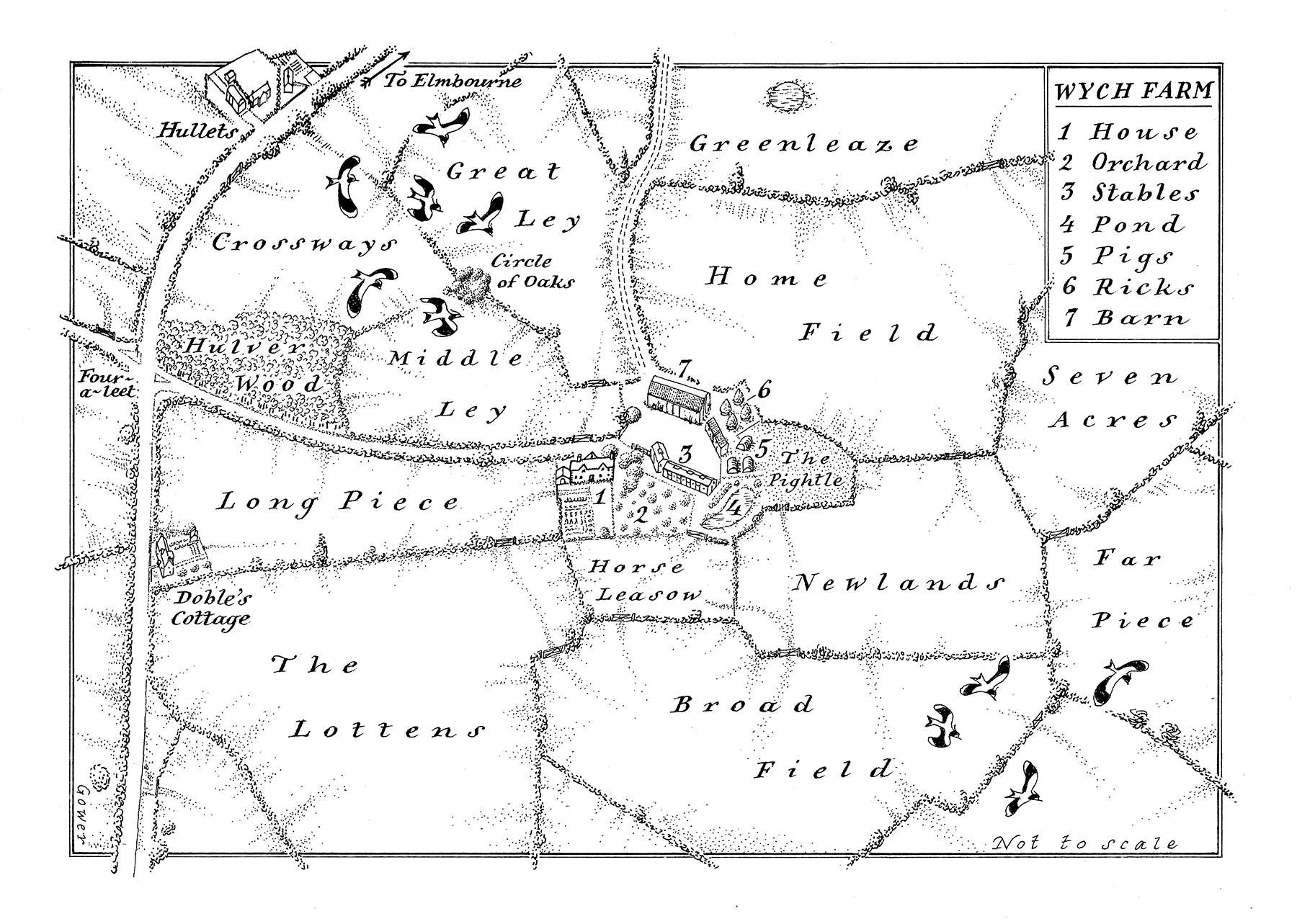
All Among The Barley is set on Wych Farm in 60 acres of Suffolk farmland. In the drought year of 1933 Edie Mather turns 13 – she is bright, impressionable and ‘strangely suspended’ on the cusp of womanhood. The Mathers have tilled these acres for generations and the narrative sings with the interwoven cycles of their lives: of seasons, weather, harvests, births, deaths, Edie’s 'monthlies'; wars, even. Constance Fitzallan arrives from London with a red bicycle and a hint of glamour. Her enthusiasm for documenting fading rural life, lore and language is matched by Edie’s fascination with her and the life she represents beyond Suffolk. Edie’s coming of age is learning to trust her own instinct that something more than just nostalgia lies behind the older woman’s interests.
The completeness of Harrison’s maps indicated that they had been an integral part of the novel’s creation. She inhabits the landscape intimately, like her characters, who seem to have emerged straight from it as readily and naturally as the flints they clear from the soil each year. To accompany her own maps, Melissa also sent me stylistic cues in the form of an 1853 tithe map and a 1941 Tunnicliffe map (from Faber’s first edition of Henry Williamson’s The Story of a Norfolk Farm). My maps would need to incorporate the clear-eyed history of the former and evoke the latter period whilst eliminating any hint of sentimentality. The novel is a timely exploration of the dangers of nostalgia for a rural idyll – a ‘Deep England’ – that never existed and it does so through a profound understanding of the natural world and agricultural heritage that spilled into the emails I received in response to my initial sketches.
'The layout of the buildings: I think that the farmhouse is creeping too close to the grouping of the yard/barn etc, it should be a little bit separate... This would be to keep farmyard smells away from the house and also prevent any sparks from the farmhouse chimney setting light to the ricks/barn. Could you nudge it very slightly to the left and have it facing north rather than north-east? Maybe an elm could come between it and the farmyard, too. Thank you.
In the book there's a signpost at the four-a-leet, and thinking back to Suffolk lanes you often get a little triangle of grass left as an island with a white signpost on it. This is because the junctions were formed by carts/wagons and not cars. Carts can't turn such a tight corner as cars can (I have not represented this on my rough so apologies). Please could you open up the crossroads a bit so that it looks more organic, and maybe shows the signpost/grass triangle (though not if scale is wrong)?'
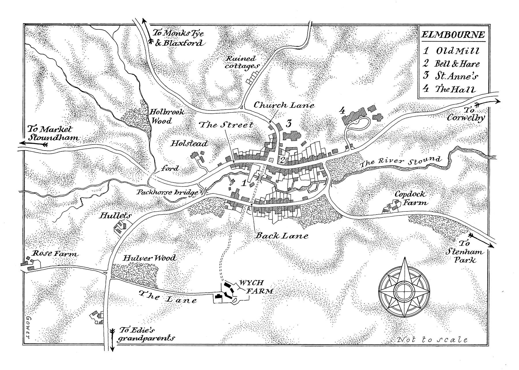 Such minute attention to detail prompted a reciprocal determination in me to find any geographical inconsistencies in the manuscript. For the record, I spotted only one – the unfeasibility of seeing a grazing horse from a certain window. In addition to being textually watertight, the maps needed to have an implicit history: the remnants of the hedge that had been grubbed up to make two fields into one had to be visible and the banks of the River Stound in the centre of Elmbourne had to look as if they had been ‘worked’.
Style-wise, we decided to lose Tunnicliffe’s earthbound creatures and ornamental weather-vane as their presence and dislocation of scale strayed towards the twee. Instead, I allowed a handful of peewits to fly into the frame, giving dimension and breath to the air above the land. The lettering was based on the tithe map with the spacing adjusted to echo the concentric rhythms in the narrative.
It is being alert to such details that makes reading for work a very different experience from reading for pleasure. The former requires an altered state of mind, a sharpening of senses to notice recurring images, patterns. One learns to allow the words to take on a shifting, kaleidoscopic quality. The process has an enveloping immediacy that I compare with driving a car stuck in first gear – it feels intense, noisy and inefficient.
My manuscript readings of All Among the Barley took place in December 2017 with an obsessive focus on geographical detail and the maps were drawn in the harsh depths of January. In March, en route to Aldeburgh Literary Festival, I drove Melissa home to Suffolk from London through grimy, collapsed-lung snowdrifts. As I write, at the tail-end of an incendiary summer, the landscape where I live is a patchwork of Tuscan ochres dotted with clouds of honey-coloured dust where combine harvesters slowly ply. A handsome hardback arrives by post, the whiff of ink and hazard on its orange jacket and angular title font. I open it … there is a frisson as I see my maps in print for the first time, nestling between Epigraph and Prologue. Then I begin to read and the prose pops off the pages, lustrous and fresh with a beauty I’d missed when first reading on ‘map-alert’…
With the first of the cornfields cut to stubble came a presage of winter. At once the hedges stood out more starkly, the land revealing half-remembered contours long hidden by the corn, and it was not so hard to imagine the fields ploughed to rich brown furrows ready for the frost to break up the clods.
…and yet another small epiphany as I realise how deeply the relationship between visual art and the written word has ingrained itself into the rhythm and topography of not only this book but my own year and, I now see, my own life as a reader and artist.
Melissa Harrison is a writer, novelist and journalist. Her first novel, Clay, was publiished by Bloomsbury in 2013 and her second, At Hawthorn Time (Bloomsbury, 2015), was shortlisted for the 2015 Costa Novel Award. All Among the Barley was published by Bloomsbury in August 2018.
Melissa won the John Muir Trust’s ‘Wild Writing’ Award in 2010 and was a Writer in Residence at Gladstone’s Library in 2014. She has appeared on Radio 4’s Open Book and The Arts Show on Radio 2, and also writes for the Nature Notes column in The Times.
Melissa lives in Suffolk, England and you can follow her @M_Z_Harrison on Twitter
Neil Gower is an internationally acclaimed graphic artist, working in a wide range of media and styles. Over the past 30 years his clients have included most major publishing houses in the UK & US – Faber & Faber, Penguin, Random House, Transworld, Knopf – and magazines such as The New Yorker, The Economist and Vanity Fair and spent ten years as Contributing Artist to Conde Nast Traveler in New York. He has also recently engaged in private commissions for Raymond Blanc and Sir Roy Strong.
His passion for drawing, colour and letterforms – and exploring the infinite possibilites for combining them – remains undiminished.
Neil is a valued contributor to Elementum Journal and lives in Sussex, England. You can follow him @neiljgower on Twitter and on Instagram.